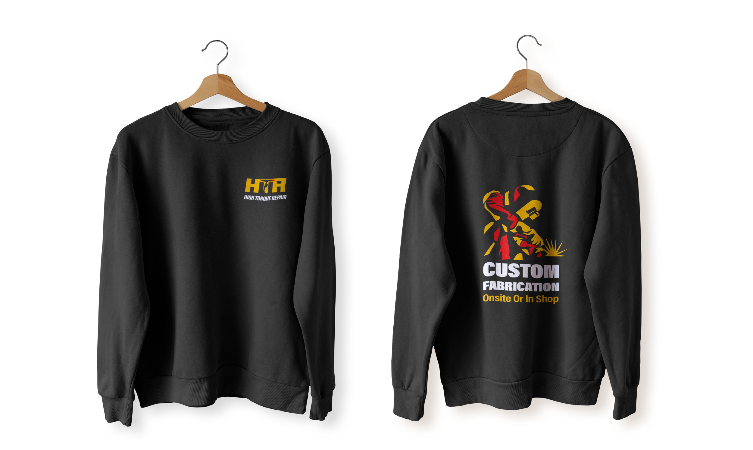
HIGH TORQUE REPAIR
HTR initially originated as a client-focused rebranding endeavor with the primary aim of crafting a brand and logo that embraced cleanliness, minimalism, and ease of print. However, due to budgetary constraints and unforeseen challenges, the project remained incomplete for the client.
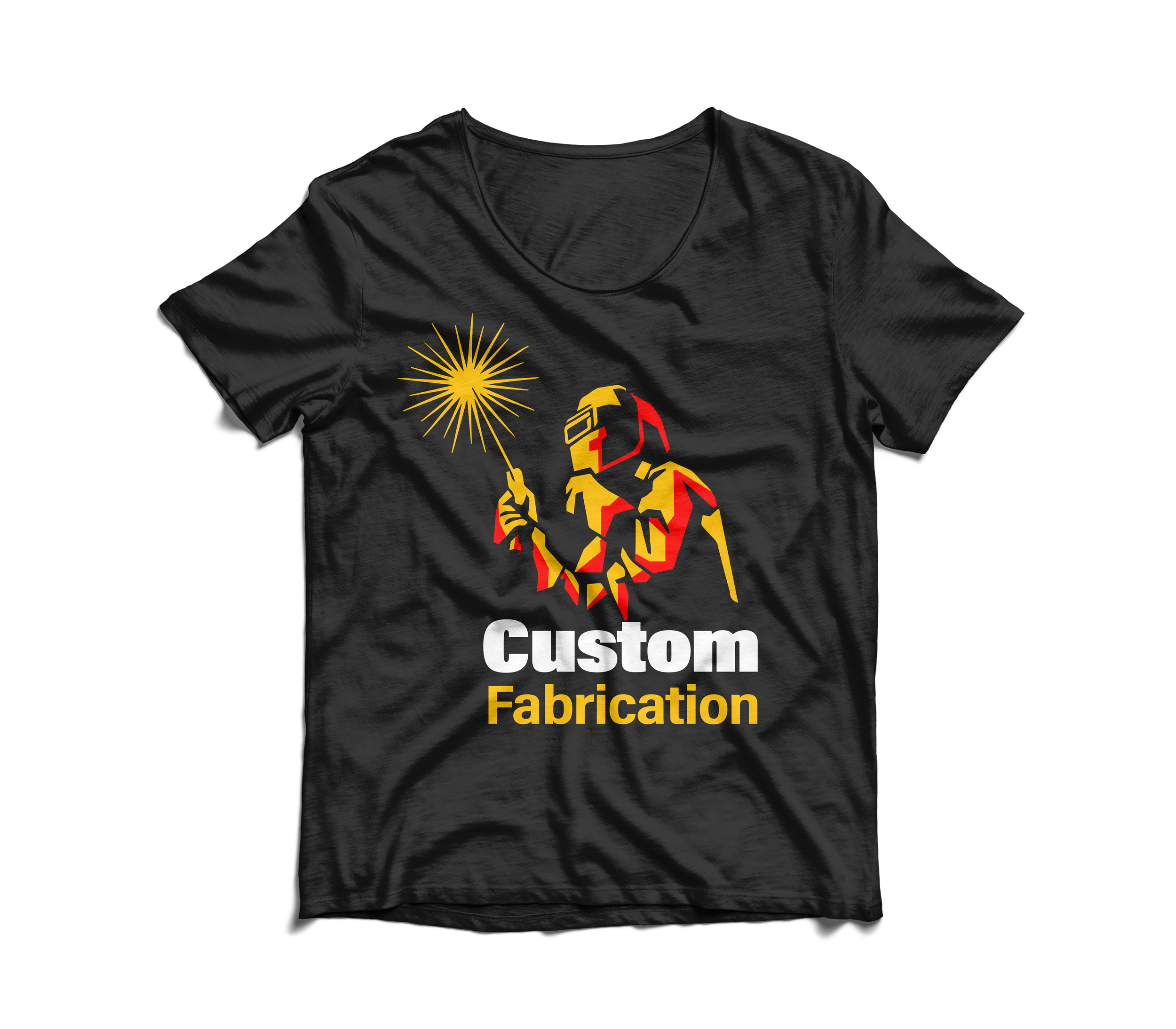
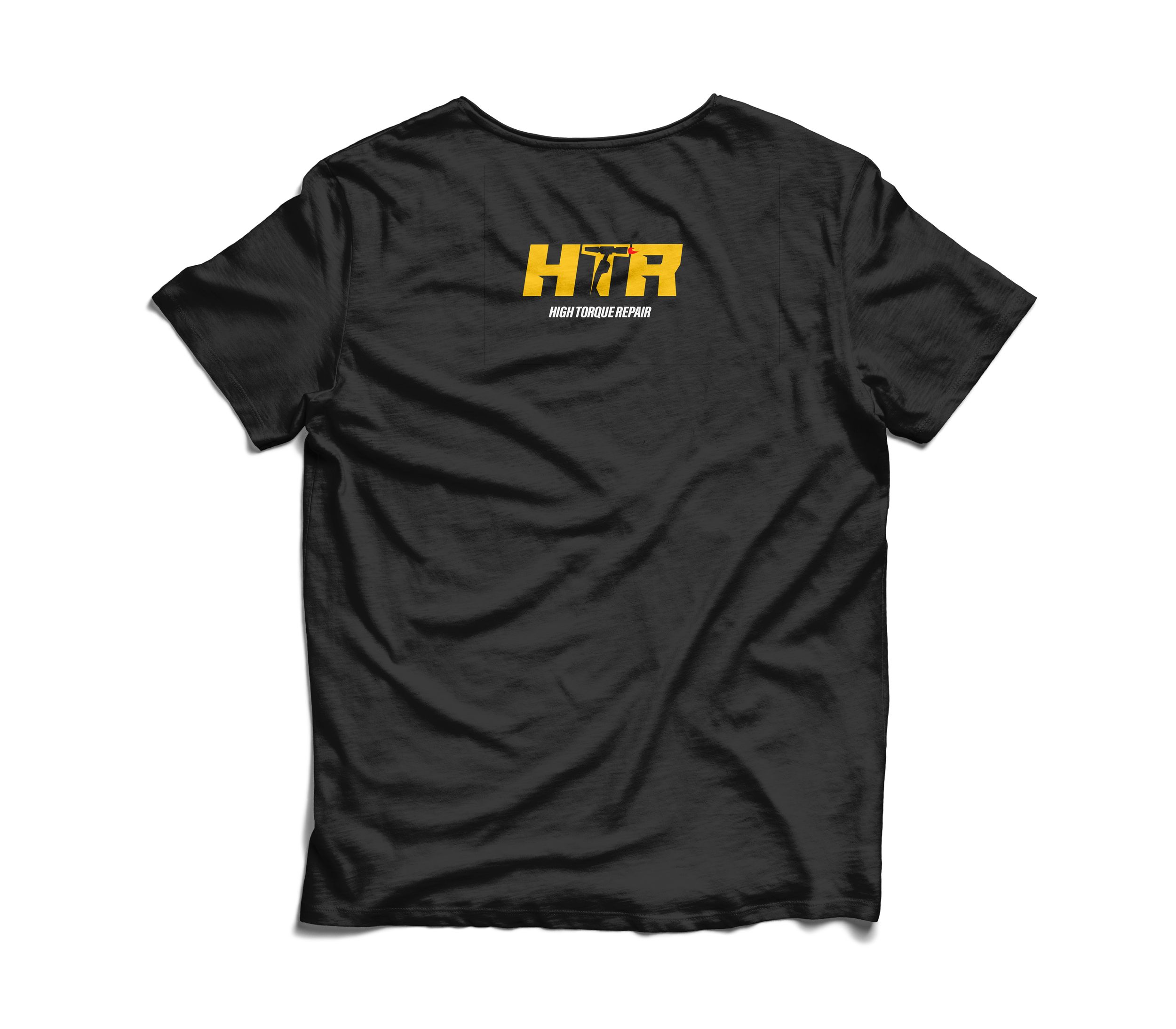
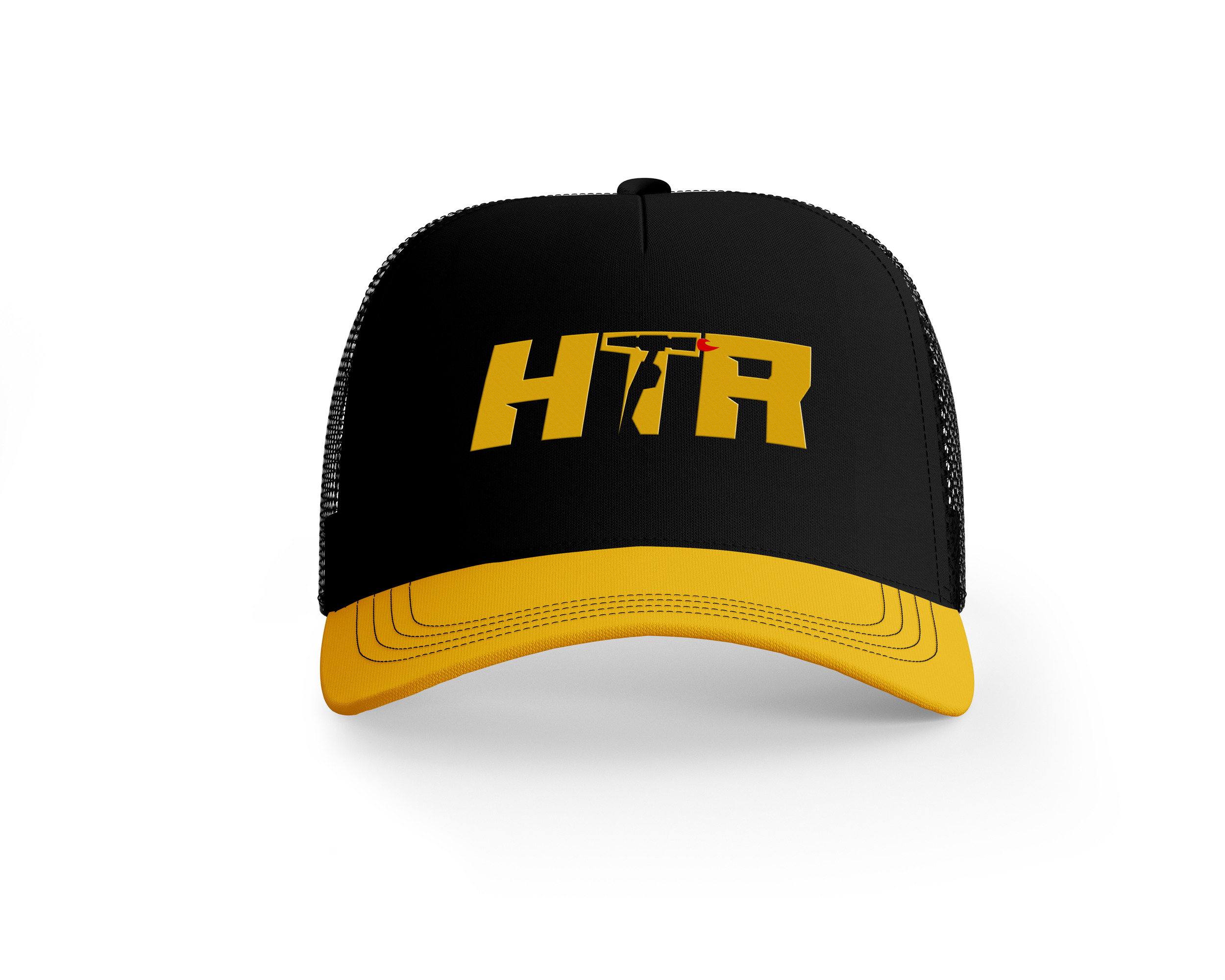
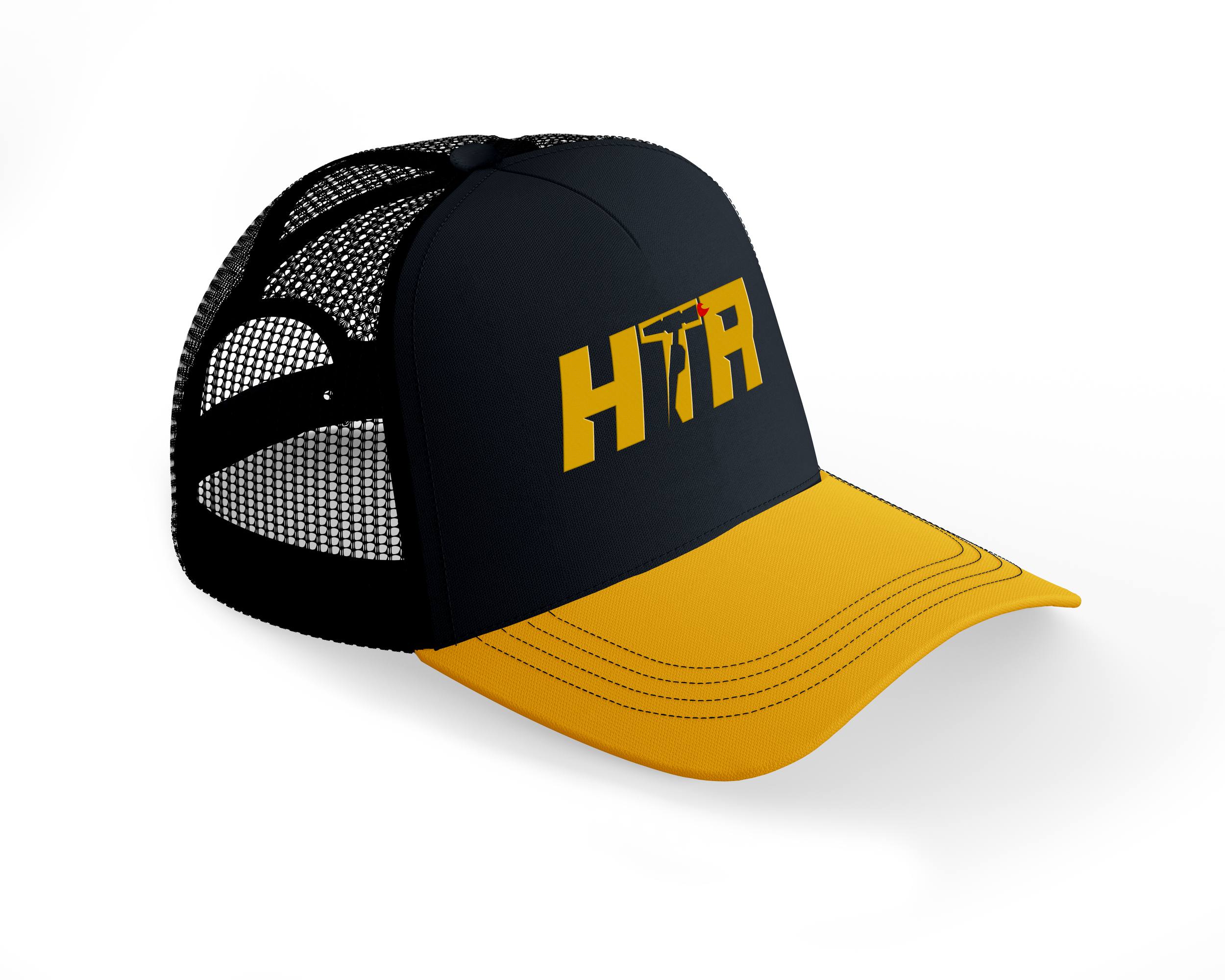
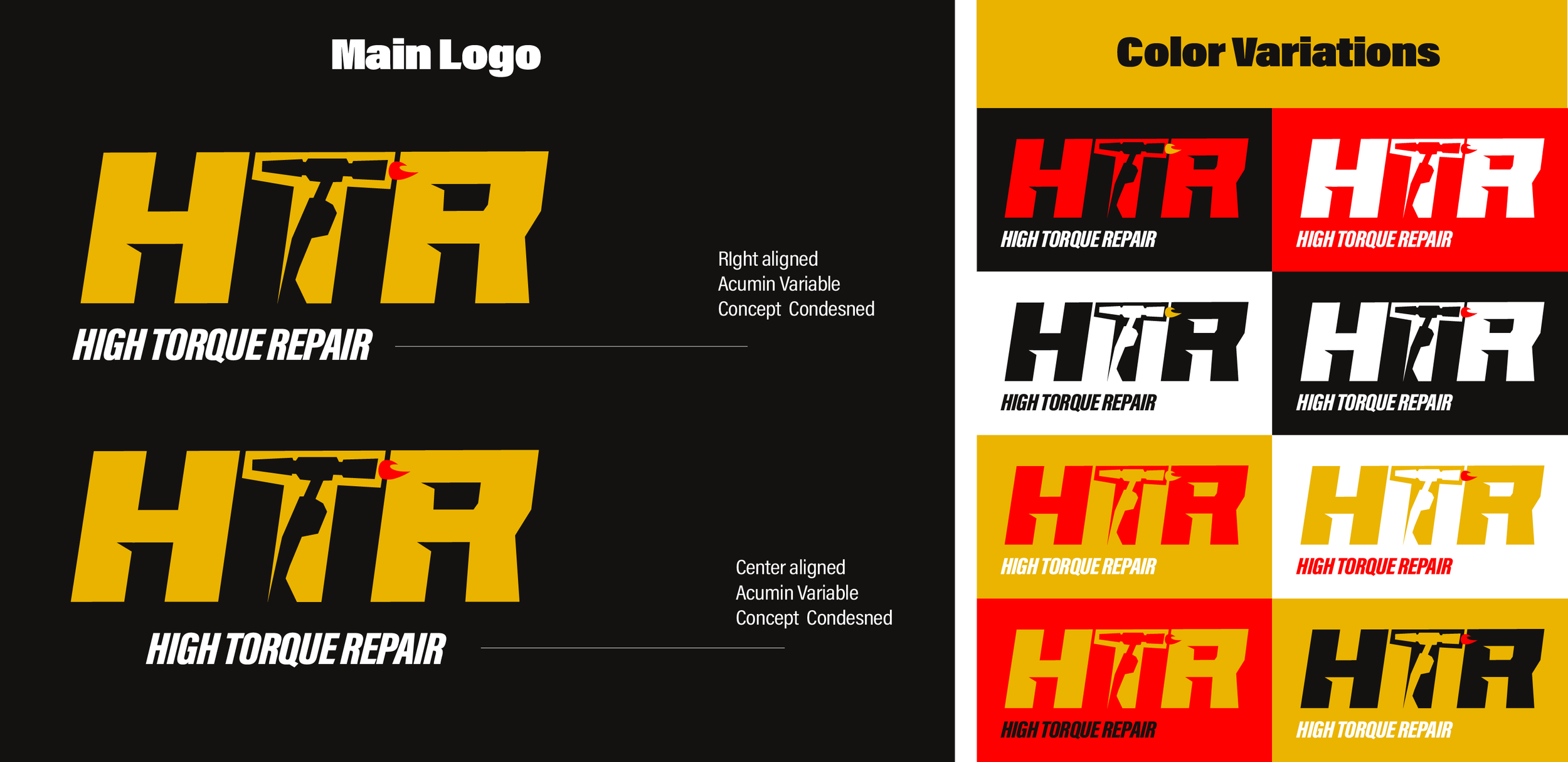
After some time, I revisited the project independently, driven by my passion for design. The HTR logo, born from this endeavor, embodies simplicity, readability, and versatility. It ingeniously replaces the 'T' with an acetylene torch, a key tool employed by the company in their metal structure repair work.
The logo not only excels in printability and legibility but also offers flexibility in color application. In my design, I opted for a color palette featuring Red, Black, and Yellow. These colors were deliberately chosen to symbolize fire, molten metal, and ash – elements that lie at the very core of HTR's business identity.

In the process of conceiving the logo concept, I explored various iterations, experimenting with different forms of iconography commonly associated with welding and metalwork. The overarching goal was to craft a type-based logo that possessed both distinctiveness and ease of reproducibility. Among the symbols considered, I zeroed in on the acetylene torch, a pivotal tool wielded by HTR's welders. Additionally, my research revealed that this torch icon was less frequently employed by other companies compared to the conventional welding mask symbols. For the final logo, I opted for a hand-drawn italic font, injecting a unique touch by incorporating notches into the typography that subtly echoed the appearance of steel beams. To maintain brand consistency, I selected the Acumen variable concept as the font system. This choice was guided by the font's versatility, enabling the utilization of various weights to foster a cohesive and harmonious brand identity across diverse applications.

Brand Stationary
In crafting the brand's stationery, I meticulously designed a range of essential materials, including business cards, stickers, a brochure, and a versatile letterhead suitable for both email communication and invoices. Additionally, I provided a conceptual representation of how the desktop and mobile versions of their website homepage might appear, should they choose to adopt an online presence in the future. Throughout the creation of these assets, I prioritized the integration of real-world imagery that authentically reflected the brand's essence. Extensive research into consumer preferences indicated a strong inclination for tangible, real-world visuals over abstract graphics, particularly for a company of this nature. The graphic elements incorporated into the stationery were intentionally straightforward, drawing inspiration from the nuts, bolts, and various metal components encountered by welders in their daily work. I employed basic shapes and colors to infuse a vibrant energy into the materials, while strategically using shapes and gradients to guide the viewer's gaze seamlessly across the page, enhancing content engagement and visual flow.


Brand assets

