American Journal of Health Care Strategy

AJHCS represents a client-driven initiative focused on establishing a cutting-edge, complementary medical journal. This endeavor is dedicated to providing invaluable resources for both seasoned professionals and aspiring students in the medical field, enabling them to stay abreast of the latest developments in healthcare. In our capacity as editors and publishers, we serve as a vital platform, amplifying the voices of esteemed members of the medical community who are eager to disseminate their groundbreaking research.

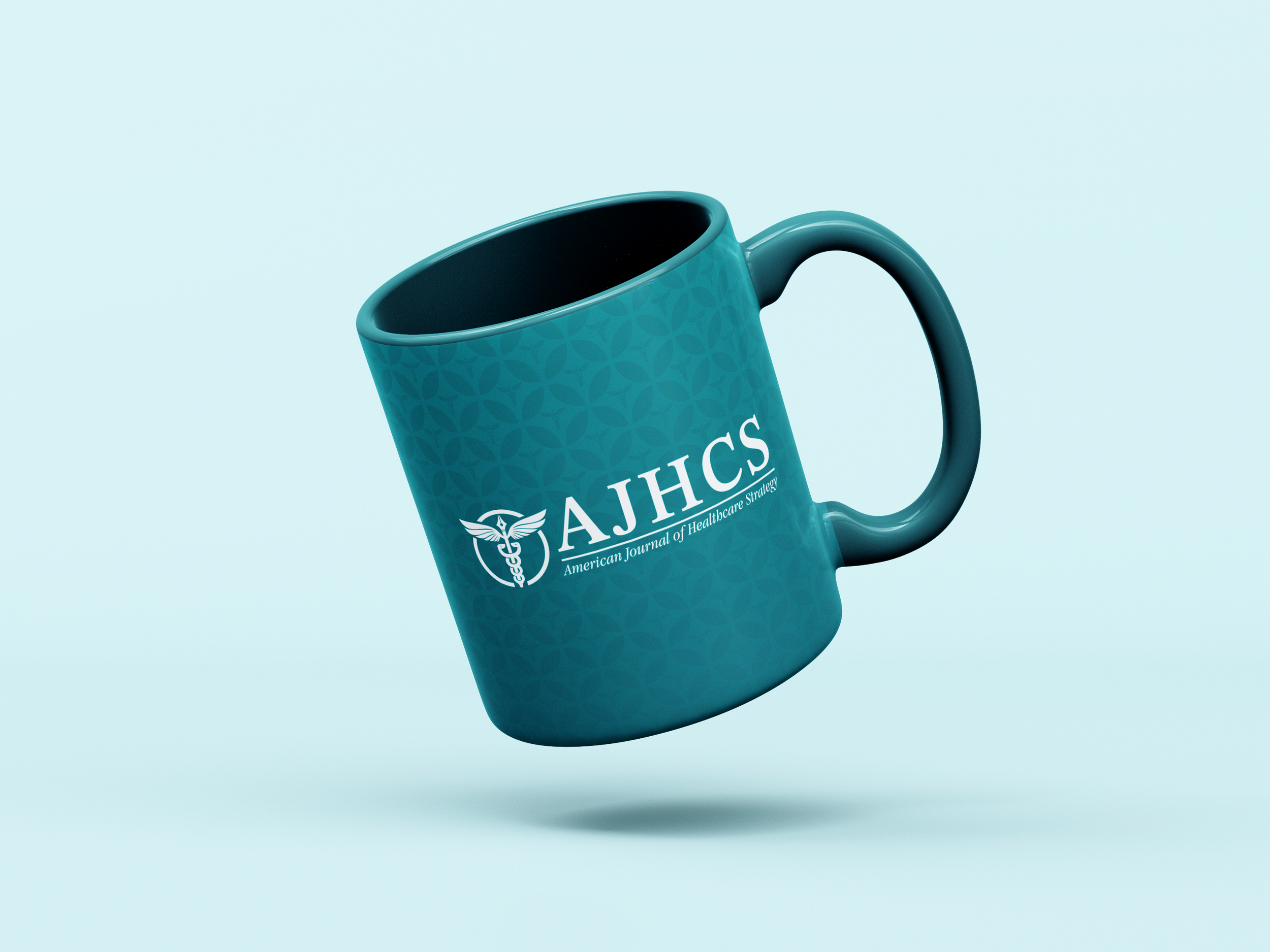
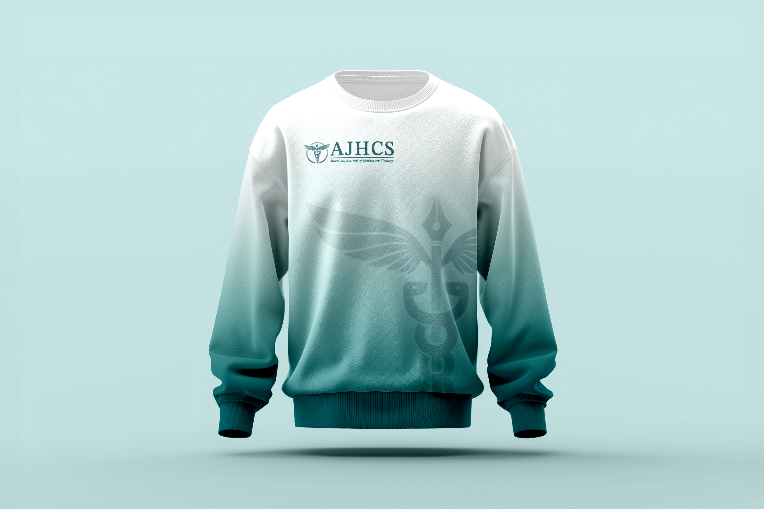
In crafting the logo design, my primary emphasis was on integrating imagery that symbolizes both the realm of medicine and the act of writing. Our objective for the logo was to achieve a harmonious blend of simplicity and intellect, resonating with a sense of intelligence. The ultimate design elegantly merges the iconic caduceus symbol with the vintage charm of an antique pen.

The selection of a blue and green color palette was deliberate, as these hues exude a calming and soothing aura. Furthermore, color theory highlights green as being closely associated with concepts of good health, serenity, and renewal, while blue is recognized for its connection to freedom, intuition, and inspiration. This choice of colors enhances the logo's capacity to evoke feelings of wellness and creativity in our audience.

Brand Stationery

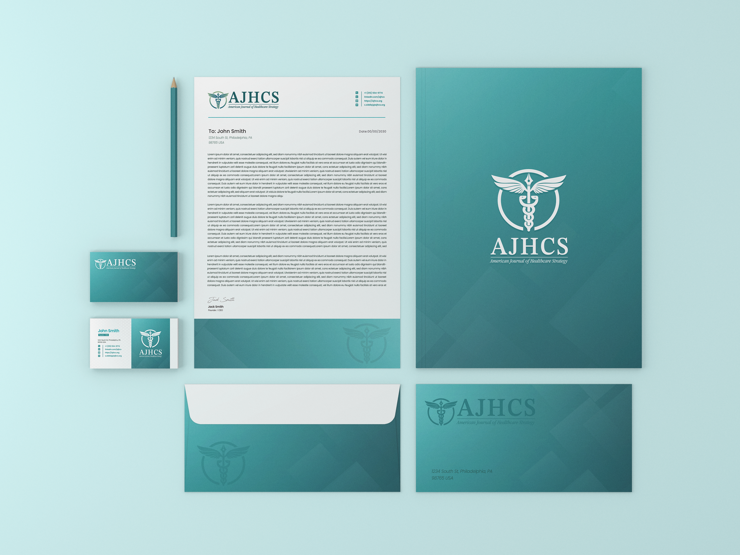
Designing custom stationery for a company is vital for branding, professionalism, and marketing. It fosters a consistent and professional image, instilling trust in clients and partners while making the company more memorable. Custom stationery serves as a subtle yet effective marketing tool, promoting the brand with every piece of communication. It ensures consistency across channels, lends credibility to legal documents, and positively influences customer perception, ultimately boosting employee morale. In essence, custom stationery is an investment in a company's success and reputation, impacting both its external image and internal culture. All the stationary designed is easily editable and focuses on using a few simple flat colors to make everything easy and cheap to print.

Desktop and Mobile

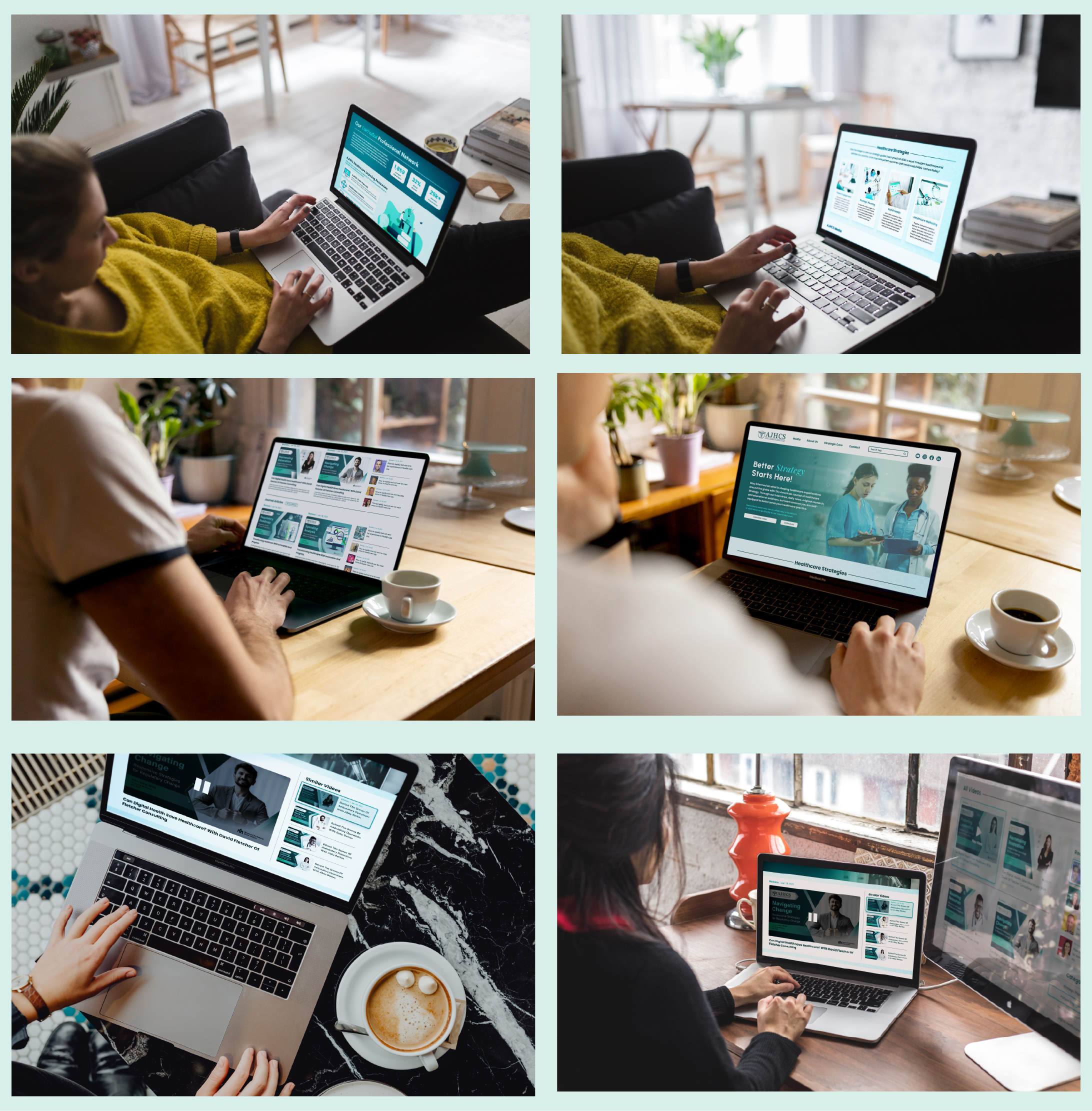
In designing both the desktop and mobile versions of the website, I prioritized simplicity and clarity. To achieve this, I created a single-scroll homepage that consolidates the majority of the company's information, making it user-friendly. This homepage structure aligns with the top menu links, offering users a clear preview of what to expect. As users enter the site, they're presented with a prominent article submission link, encouraging immediate engagement. Further down, the homepage smoothly transitions into an explanation of why our editing and publishing services are superior, followed by the most recent article posts, complete with descriptions and direct links. This streamlined design enhances user navigation and overall experience.

Previous
Previous

Fizzy Bud THC Hard Seltzer Label Design

Next
Next

The Cats Meow Jazz Bar